Tech tutorials 2016: A Powerful Year for Power BI
By Insight Editor / 15 Mar 2017 , Updated on 16 May 2019 / Topics: Analytics
By Insight Editor / 15 Mar 2017 , Updated on 16 May 2019 / Topics: Analytics
The year 2016 was an eventful one for a lot of reasons. Most importantly (OK, maybe not most importantly), Microsoft solidified its position as a top choice among vendors for Business Intelligence (BI) analytics tools. Boasting ease of use coupled with the ability to create powerful data visualizations, Microsoft pulled ahead of competitors, according to the 2015 and 2016 Gartner Magic Quadrant for Business Intelligence and Analytics Platforms.
However, it doesn’t stop there. This momentum continued through the rest of 2016 and into 2017. But how did Microsoft pull so far ahead?
Easy — Microsoft listened to its users and critics.
Microsoft is constantly working to improve its offerings, specifically Power BI. The company created an online forum for Power BI where users can suggest and vote for product enhancements. The enhancements with the most votes get implemented (assuming the enhancements are feasible). It really is that simple.
When I’ve introduced Power BI to clients in the past, many were excited by the product but voiced concerns about limitations in functionality and security. This spurred me to get on the Power BI idea forum. I found that many other users shared these concerns.
Microsoft addressed these and many others by introducing a multitude of updates and enhancements over the past year. There are too many to call out here, but following are a few of my favorites (some of which I personally voted for — the system works):
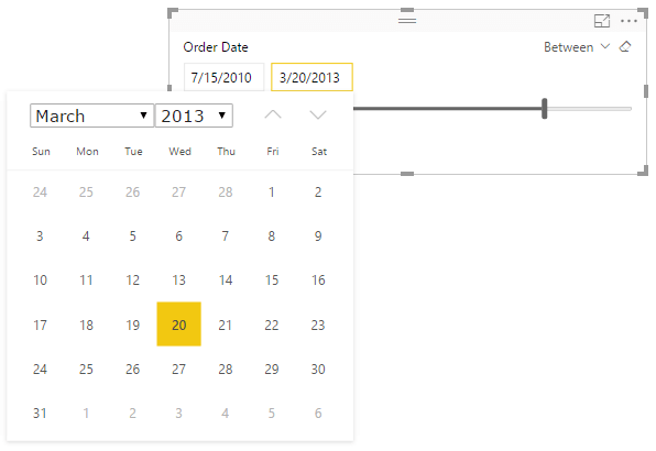
Date slicer
Power BI uses slicers to allow end users to filter data in a report. In October 2016, Microsoft introduced a date slicer, making it easier to filter a report based on dates. There were plenty of workarounds to get the normal slicers to behave properly with dates, but the new date slicer makes the experience easier and more visually pleasing. It makes use of a slider bar and a calendar interface to allow users to select a specific date or date range.
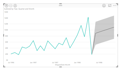
Analytics pane with forecasting
In September 2016, Microsoft introduced the Analytics pane, enabling users to easily create and format dynamic reference lines on certain visual types. In November 2016, forecasting was officially added to the Analytics pane. Forecasting is a special feature that allows developers to predict and display future data values based on the current available information and trends. Following is an example of forecasting in action. The highlighted gray area of the chart displays the forecasted values.
Row-level security
I’ve had several clients ask for a way to restrict data within a report or dashboard based on the user accessing it. Although there are always workarounds, Microsoft added row-level security to Power BI data models, which can be used to restrict data access for given users, making this task easier than ever.
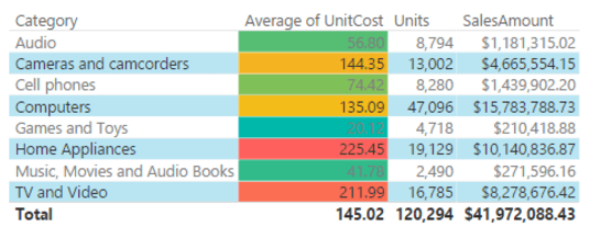
Conditional formatting in matrices and tables
Of all the enhancements, this is the one I was most excited about. It’s one end users have asked me for time and time again: the ability to format matrices and tables based on data values within each cell. With the addition of conditional formatting of matrices and tables to Power BI in May 2016, this is possible. Developers can call out important values by changing their color, which makes it easier for end users to gain insight from a table at a glance.
The above updates represent only a small portion of the long list of enhancements made to Power BI since its creation. The biggest takeaway is Microsoft is constantly updating and improving Power BI based on what users and developers want to see.
To request an enhancement, or to vote for your favorites, visit the Power BI Idea forum. When using the forum, it’s always a good idea to do a quick search first to see if your idea or a similar one has already been submitted. If it has, vote for it.
Source: Microsoft Docs Power BI Updates
Advertisement