Tech tutorials 8 Pixel Grid
By Insight Editor / 6 Dec 2017 , Updated on 16 May 2019 / Topics: Customer experience
By Insight Editor / 6 Dec 2017 , Updated on 16 May 2019 / Topics: Customer experience
Using a defined grid during user interface design allows you to speed up the process by allowing for fewer decisions, giving you a more consistent look and feel throughout the application. We like using this method to speed the transition between the UI designer and UI developer. It also makes scaling for a wide variety of devices better since most popular screen resolutions are divisible by eight.
There are two types of grids:
Hard grid — Elements are sectioned off and positioned relative to a container element higher up in the hierarchy.
Soft grid — Individual elements are positioned relative to each other rather than to an actual grid.
When starting a new project, we want to make sure we have our Sketch file set up for implementing the 8-pixel grid perfectly. I’ve been using this process for the past couple of projects. This alone has allowed me to speed up my design process.
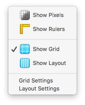
First, you need to set up Sketch to use the grid system.
This will display a pop-up allowing you to change the block size. Here, you want to make each block size 8px, then a thicker line every 10 blocks.
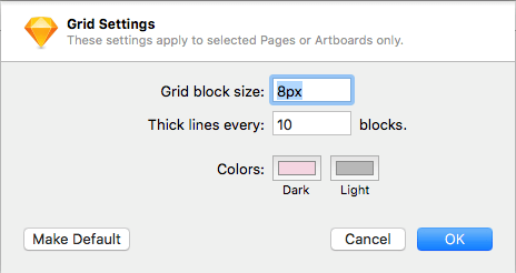
This will allow us to use a hard grid when setting spacing on containers and other components we build.
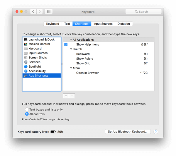
By default, Sketch doesn’t have a shortcut to toggle the grid. Here you can access our system preferences to add a shortcut command to toggle the grid.
I went with the Adobe shortcuts because I’ve had experience using them for years, so it made sense to use the same ones.
Now that you have the basic grid set up, you need to start setting up the metrics you’ll be using.
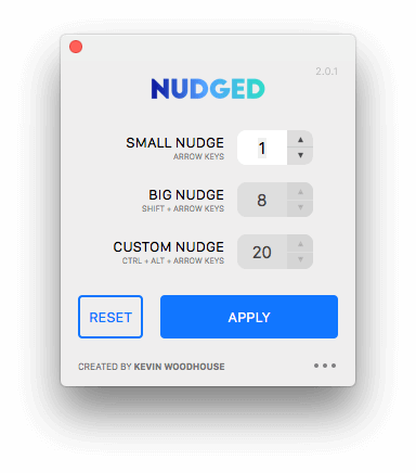
Before you start building out metrics, you must change the default nudge values. Currently, Sketch operates at a 10px nudge. However, you want to change that to better fit the 8-pixel grid. You’ll need to install the Nudge Sketch plug-in .
After that’s installed, you’ll need to change the big nudge to be 8 pixels.
The metrics will allow us to have consistent spacing throughout the design. Our blocks will be in increments of eight. You’ll want these shared styles to be easily applied when creating your spacing.
To start, highlight the element you want to make a shared style. From there, head over to the right tool bar, where you’ll find a drop-down labeled “no shared style.” This is where you want to start adding in your styles. In the drop-down, click Create new style and then assign it the value name. If you’re using 8px, give it a value of 8px. This will go for every style you create.
After all shared styles are created, you should have around 14 different items, depending on how large your spacing is.
From there, each block will have a new color that will have 50% opacity. You should end up having 14 shared styles.
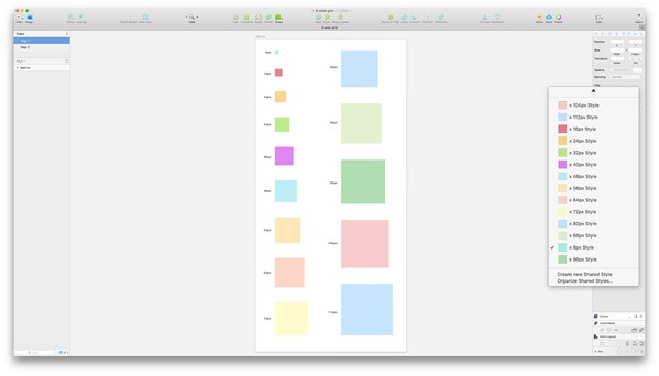
This is what you should end up with after creating all shared styles.
Before you start building out the product cards, there’s still more setup to be done. You should have already installed Nudged. Now we’ll need to install the plug-in Layer Tools. You’ll mainly be focused on one particular one: Layer Tools – Toggle. This will allow us to toggle folders with certain names.
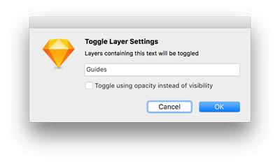
You’ll see this in action later, so for now, choose OK and let’s start building.
This is where the fun really begins. Now that we have our grid system set up and our default spacing share styles saved, we can start using them in projects.
Let’s take a look at the product cards on 53.com and focus on setting up the individual product cards spacing.

You’ll want to focus on the outermost padding of the card. Here, we’ll want to implement our spacing with the metrics we set up earlier.
Grouping the guides allows us to use our layer settings we set up earlier. You can also use perfect squares when spacing and then pull guides into place if you feel the color is too much.

Outer spacing
Card title spacing

Block section spacing

All together now
Now, since we have all our guides labeled and grouped, we can toggle them on/off with this shortcut:
In many ways, this can benefit UI designers and UI developers focused on building more componentized interfaces. It takes a simplistic approach to spacing not only for using in designs, but for the development process too.
Advertisement