Tech tutorials Alphabet Soup: CSS Architecture for Large-Scale Web Projects
By Insight Editor / 12 Dec 2017 , Updated on 16 May 2019
By Insight Editor / 12 Dec 2017 , Updated on 16 May 2019
Remember getting alphabet soup as a kid and trying to spell out your name? It was so hard because the letters were all jumbled up, stuck to the sides of the bowl or buried at the bottom. Sure, it could be done, but how long would it take?
Imagine if the soup was on a plate with the letters in alphabetical order. You could quickly spell as many words as you’d like. Good CSS architecture is just like that plate. We should strive to hand off our CSS on a plate — easy to find, easy to scale and easy to reuse.
“Writing CSS is easy; looking after it is not.” — Harry Roberts
CSS is easy to write, right? Anyone can open the dev tools in Chrome and start changing the font colors, padding and margins. If it’s so easy to write, why do so many teams get it wrong? Important flags everywhere, selectors highly tied to the markup, and the same lines of code copied and pasted throughout the project. The reason so many teams get it wrong is the lack of upfront planning around the UI and CSS architecture.

We’ve all been there: assigned to a new project, asked to make some small tweaks and, as we dig into the CSS, find a messy, nested selector. We’re too afraid to change it so we slap on the important flag. But how do we stop this cycle? The answer: CSS architecture.
CSS architecture is the methodologies and naming conventions your team sets out to follow to ensure the components you build will be scalable, reusable and easy to maintain into the future. Let’s explore a few options and some of the benefits they offer.
Scalable and Modular Architecture for CSS (SMACSS) was created in June 2013 by Jonathan Snook. His book was the first of its kind and defined the idea of grouping your CSS selectors in five categories: Base, Layout, Module, State and Theme.
Base rules are the default styles that should be applied to HTML elements. Layout rules divide the page into sections, like a grid, for example. Modules are those reusable parts of the design, like callouts and sidebar sections. State rules are those that describe how modules or layout will look in a particular state. Finally, Theme rules describe cosmetically how a module may change when a given theme is applied.
SMACSS is a great option for those starting a new project who want to get their feet wet with easy-to-find UI code.
Inverted Triangle CSS (ITCSS) is a methodology created by Harry Roberts that organizes a project’s styles as a layered, upside-down triangle. ITCSS takes SMACSS to the next level by not only grouping styles, but also focusing on the order of importing styles to reduce inheritance and specificity issues for the entire document. It’s a model that allows the developer to manage the CSS in the most effective and least wasteful way. Here’s a breakdown of the layers:
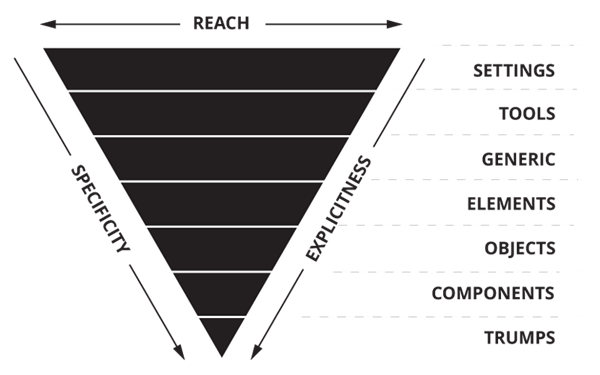
Used in conjunction with a preprocessor such as Sass, here’s how Roberts defines the seven layers:
While SMACSS and ITCSS are great options to organize your CSS, they don’t tell you how to write it. For that, we use namespacing and Block, Element, Modifier (BEM).
What does this class do? What happens if I change this class? To solve these common global stylesheet questions, we prefix all classes to communicate the roles and responsibilities of a class at a global level. Here are some common namespaces:
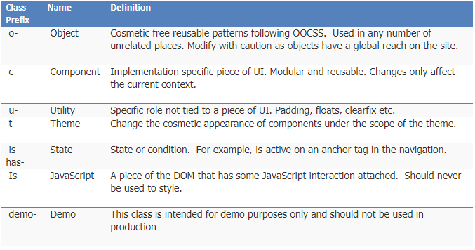
To learn more about namespaces, read Roberts’ detailed blog post.
Created by the guys at Yandex, BEM communicates the roles and responsibilities of a class at the component level. It allows the UI developer to avoid inheritance and provide a unique scope. BEM also states that each element should have its own class applied — thus, keeping the specificity to a minimum level. Let’s take a look:
c-hero = standalone entity that is meaningful on its own
c-hero__blurb = a part of a block, noted by two underscores, that has no standalone meaning and is semantically tied to its block
c-hero__blurb--primary = a flag, noted by two dashes, on a block or element; used to change appearance or behavior
If you don’t plan how the interface will be built and maintained, you’ll be handing off a jumbled mess of letters in a bowl. If you architect your UI code using naming conventions, such as BEM, and structure your files following ITCSS, you’ll be handing off a plate. A plate to allow new team members to quickly ramp up. A plate for long-term maintainability. A plate for smoother project handoffs.
Advertisement