Tech tutorials Android Login Pad
By Insight Editor / 20 Nov 2014 / Topics: Application development
At Insight, we pride ourselves on our ability to create custom solutions that exceed customer expectations. We often design and develop apps in unison for the two major mobile platforms: Android and iOS.
On occasion, a client will have a specific request for both platforms to look and feel identical. Our designers and developers collaborate to conceptualize and create a custom solution to meet the client’s expectations. On one occasion, we were asked to create a login screen that looks and functions like the iPhone lock screen. Here’s how we did it.
Solution
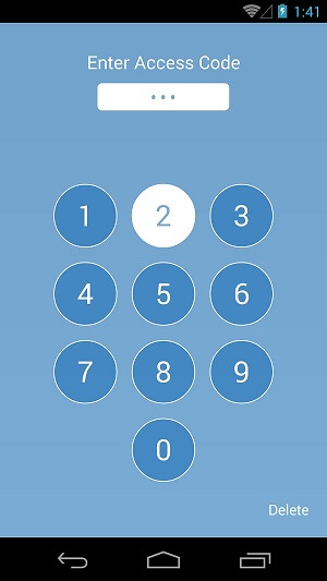
We created the Android Login Pad. The pad is similar to the iOS 7 lock screen in that the pad circles and numbers swap colors as the user presses them:
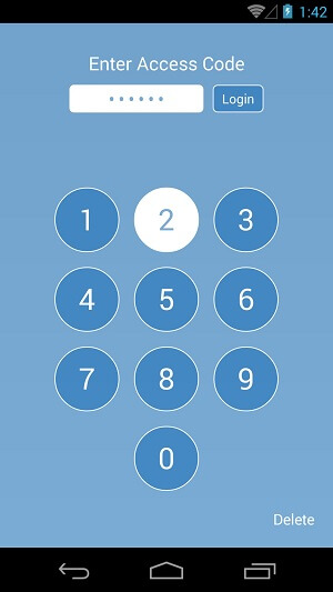
Once the required length is met for the login pin (constant defined inside the activity), the login button animates in next to the pin field:
Technical details
Note: This section assumes the user has some amount of Android development experience to understand the terminologies and code examples.
Toggling button colors
The color changes on the button presses are done through the use of pressed states and resource drawables. Each button on the pad has its background set to:
android:background="@drawable/login_pad_circle "
This drawable is an XML file found in the res/drawable folder of the project, and it looks like this:
<?xml version="1.0" encoding="utf-8"?>
<selector xmlns:android="http://schemas.android.com/apk/res/android" >
    <item
        android:drawable="@drawable/login_pad_circle_pressed"
        android:state_enabled="true"
        android:state_pressed="true"/>

    <item
        android:drawable="@drawable/login_pad_circle_pressed"
        android:state_enabled="true"
        android:state_focused="true"/>

     <item
         android:drawable="@drawable/login_pad_circle_normal"/>
</selector>
As you can see, the state for pressed calls another drawable, appropriately named ‘login_pad_circle_pressed.’ This drawable creates a circle with a white background and a 1dp border. It looks like this:
<?xml version="1.0" encoding="utf-8"?>
<layer-list xmlns:android="http://schemas.android.com/apk/res/android" >
    <item android:id="@android:id/progress">
        <shape
            android:shape="oval">

            <solid
                android:color="@color/white"/>
            <stroke
                android:color="@color/white"
                android:width="@dimen/one_dp"/>
        </shape>
    </item>
</layer-list>
Also, the default state calls a third drawable (login_pad_circle_normal) that makes the background blue, with a 1dp white ring to break up the look of the circles on the pad. It looks like this:
<?xml version="1.0" encoding="utf-8"?>
<layer-list xmlns:android="http://schemas.android.com/apk/res/android" >
    <item android:id="@android:id/progress">
        <shape
            android:shape="oval">

            <solid
                android:color="@color/blue"/>
            <stroke
                android:color="@color/white"
                android:width="@dimen/one_dp"/>
        </shape>
    </item>
</layer-list>
The main activity of the app implements the View.OnClickListener, and each button has its own touch listener set to the activity:
mOneButton.setOnTouchListener(this);
Implementing the View.OnClickListener gives us access to the onTouch override, where we toggle the buttons based on the pressed state:
@Override
public boolean onTouch(View vIn, MotionEvent eventIn) {
switch (vIn.getId()) {
            		case cardinalsolutions.com.loginpad.R.id.one_button:
                		toggleNumberColor(vIn, eventIn);
                		break;
}
return false;
}
When the on press occurs, we pass the view object and the motion event to the toggleNumberColor function so we can update the text color accordingly. On a down motion, the font is blue to contrast with the white background, and on an up motion press, it’s white to contrast with the blue background:
private void toggleNumberColor(View viewIn, MotionEvent eventIn) {
if (eventIn.getAction() == MotionEvent.ACTION_DOWN) {
            		((TextView) viewIn).setTextColor(getResources().getColor(
R.color.blue));
        	} else if (eventIn.getAction() == MotionEvent.ACTION_UP) {
           		 ((TextView) viewIn).setTextColor(getResources().getColor(
cardinalsolutions.com.loginpad.R.color.white));
}
}
Note: the button backgrounds are toggled via the drawables we mentioned earlier.
Animations
The animation resources reside in the res/anim folder. Each animation (in and out) has its own resource XML. For brevity, we’ll only reference the slide-out animation. The slide-out animation moves the object it’s assigned to from its current X position to the right and off the screen, in the amount of time defined (in milliseconds) in the duration tag:
<?xml version="1.0" encoding="utf-8"?>
<set
    xmlns:android="http://schemas.android.com/apk/res/android"
    android:fillAfter="true"
    android:fillEnabled="true" >

    <!-- Slide out right -->
    <translate
        android:fromXDelta="0%"
        android:toXDelta="+1000%"
        android:duration="200" />

</set>
To make the animation available to an object in the activity, we need to declare:
private Animation mAnimSlideOut;
and instantiate it in the activity:
mAnimSlideOut = AnimationUtils.loadAnimation(getApplicationContext(), cardinalsolutions.com.loginpad.R.anim.slide_out_right);
Once we have the animation object available, all we have to do is call startAnimation() and pass the animation in on the object we want animated. In this case, we’ll use the login button:
mLoginButton.startAnimation(this.mAnimSlideOut);
Finally, if we want to chain events together after an animation, we can make use of the animation listener on the animation object. For this discussion, we’re cross-fading the “delete” text out of view after the login button is pushed off screen. To make use of the listener, we just set a new instance of animation listener on the object:
mAnimSlideOut.setAnimationListener(new Animation.AnimationListener() {
});
The listener gives us a few overridden methods we can make use of: onAnimationStart onAnimationRepeat onAnimationEnd. For cross-fading the delete text off the screen, we’re making use of the onAnimationEnd:
@Override
public void onAnimationEnd(Animation animationIn) {
mLoginButton.setVisibility(View.GONE);
if (mFailedLogin) {
crossFade(getResources().getInteger(android.R.integer.config_mediu
	mAnimTime), mDeleteButton, null);
}
}
Download the sample app to see how all of this works together.
Advertisement