Tech tutorials Visualizing LUIS Data in Power BI
By Insight Editor / 31 May 2018 , Updated on 16 May 2019 / Topics: Application development Data and AI
By Insight Editor / 31 May 2018 , Updated on 16 May 2019 / Topics: Application development Data and AI
Creating an application that can understand natural human language used to be a complex affair. But thanks to the Microsoft Language Understanding Intelligent Service (LUIS), the ability to program natural language understanding into any application has never been simpler. The easy-to-use interface allows people from all different technical backgrounds to quickly and effortlessly create a custom language solution.
Part of the process of developing a great LUIS application is the frequent refinement of the intents. By adding user-created examples to your intents, you can create a more robust application. At the time of this writing, there isn’t a great way to visualize this data. This is where Power BI can help us gain powerful insights into how people are interacting with our LUIS application and facilitate our refinement process.
In this example, we’re going to use Power BI to visualize the past month of endpoint utterances and see if we can gain any insights. For this example, you’ll need a LUIS instance on Azure (there’s a free subscription tier), the app Id, subscription key, resource location and Power BI Desktop.
I’ve uploaded the Food Truck LUIS example from Microsoft GitHub into my LUIS instance and queried the endpoint 10 times with various food ordering queries.
LUIS has a suite of authoring APIs we can use to extract data about our LUIS application. The one we’ll be using for this example is the ‘GET: Download application query logs.’ This API call brings back a CSV file containing the past month’s endpoint utterances.
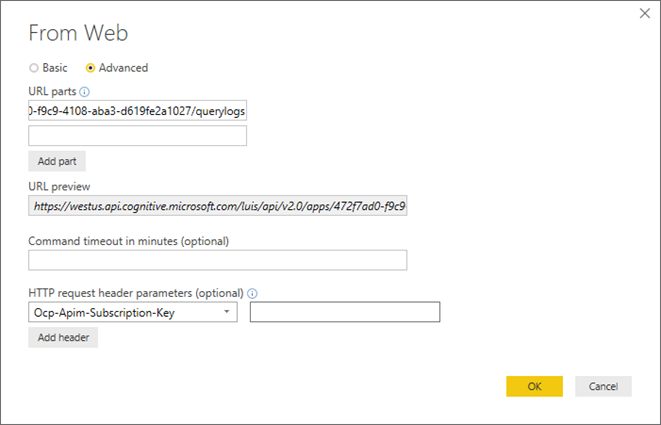
In Power BI, we can get the information from this API call by using the ‘Web’ data source. Under the advanced menu, we’ll enter in the request URL, which is formatted as follows. Be sure to add your location (i.e., westus, eastus2, etc.) and your app Id in the corresponding fields:
https://[location].api.cognitive.microsoft.com/luis/api/v2.0/apps/{appId}/querylogs
Also include the request header ‘Ocm-Apim-Subscription-Key’ field. Use the access keys you can find on your LUIS instance in the Azure Portal.
The data you pull in should look something like this:
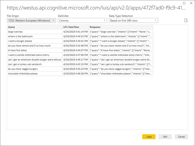
Click on Edit the data so we can format this information in an easier-to-understand fashion. To simplify the next parts, we’re going to add an index column. In the ‘Response’ column, expand everything out.
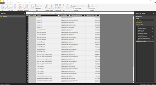
This will create more rows, but because of our index column, each item will keep its correct index. Delete the unnecessary columns. We should now have an index column, the query, the date/time it was submitted, the intent and the intents score.
For this example, we only care about the highest-scoring intent, so we’ll group all of the columns by the highest score. We’ll also include a reference to all of the other columns for future reference.
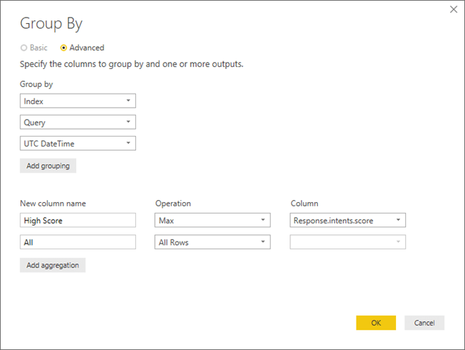
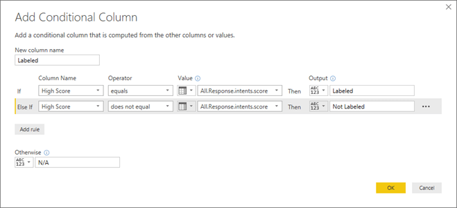
We can then expand the table that gets created under ‘All.’ This gives us the ‘High Score’ for every row, as well as the actual scores. By including a condition column that’s true when the ‘High Score’ and actual score match, we know that record must be the labeled record.
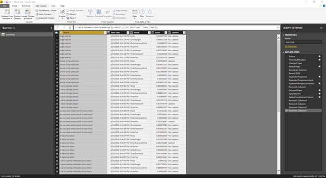
In the future, we can filter based on the ‘Labeled’ queries to get the highest-scoring label. We can clean up the data by deleting unnecessary columns, renaming columns and changing column types to the correct values. The result should look something like this table:
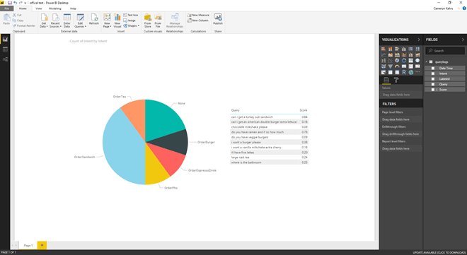
We can now start creating visuals. In this example, I’ve created a pie chart with every labeled intent and the number of each query that got labeled to that intent. By clicking on each section of the pie chart, we can see the types of queries that fall into each.
For instance, in the ‘None’ intent, we have a query asking for veggie burgers. If the restaurant does sell veggie burgers, we may want to add an example to the ‘OrderBurger’ intent about veggie burgers so that it can be more accurately categorized in the future.
We also have a request asking where the bathroom is. At the moment, the LUIS application doesn’t have a ‘FindBathroom’ intent, but it may be something we want to add. Using Power BI, we can track and see if this is a frequent request, and if it’s worth adding to the application.
By visualizing this information in Power BI, we were able to quickly and easily identify ways we can improve our LUIS application. The LUIS authoring APIs offer a wide variety of ways to get data about your application. This is only one example. Creating a great LUIS application takes repeated refinement. By using Power BI, we can greatly bolster our analysis.
Advertisement