Tech tutorials D3 as a Data Visualization Tool
By Insight Editor / 11 Jun 2015 , Updated on 16 May 2019
By Insight Editor / 11 Jun 2015 , Updated on 16 May 2019
Data visualization is becoming increasingly important in the modern workplace, especially when it comes to interactive content. D3, which stands for Data-Driven Documents, is a very flexible and robust JavaScript framework that can be used to add visually appealing and interactive data visualizations to any project.
D3 is a highly customizable and open-source library that makes it possible to create graphs and charts that are responsive, interactive and useful. Because of the platform’s open-source nature, you can take a look at the inner workings of D3 and even fork the code directly from GitHub to make your own modifications.
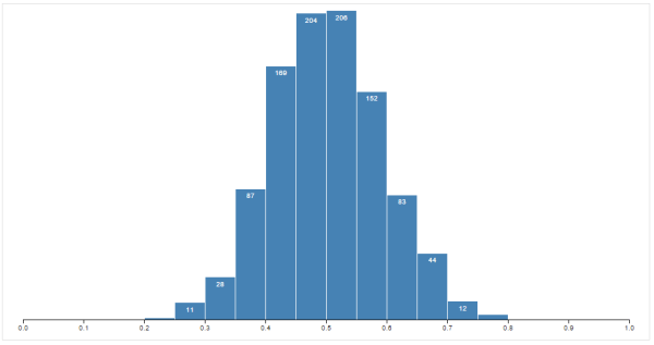
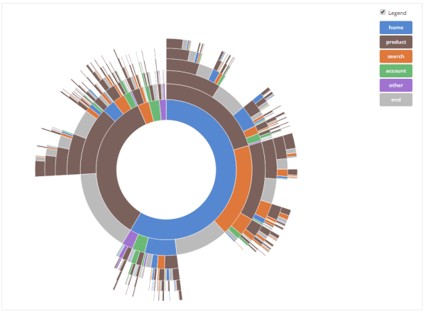
Although the learning curve for the D3 tool can be steeper than that for other frameworks, the level of customization and power you have over the code makes this cost worthwhile. This freedom allows you to create visualizations from the simple to the very advanced. Following you can see two examples, both created with D3:
Standard Histogram
Sunset Chart
Most applications written with D3 are comprised of three primary steps:
Let's take a look at a very simple example. We’ll be using an array of numbers (data), binding DOM elements (<p> tags) to the data points and making changes to that data by changing the color attribute based on whether or not the number is even or odd. Take a look at the code:
var dataset = [5, 10, 3, 9, 4];

d3.select("body")                  //find the body element
    .selectAll("p")                //select all <p> tags (none exist yet, but they will)
    .data(dataset)                 //bind the data
    .enter()                       //select DOM elements that aren't bound (or create them)
    .append("p")                   //add the new elements
    .text(function(d) {            //set the text
      return d;
    })
    .style("color", function(d) {  //and conditionally set the color based on the data value
      if(d % 2 === 0) {
        return "blue";
      }
      else {
        return "black";
      }
    });
If you run this code, you’ll see the following:
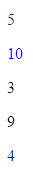
You can see the output works as we’d expect it to. While most of the functions invoked are fairly straightforward, there are a few worth taking a more detailed look into. Specifically, we’ll take a look into selectAll(), select() and enter().
The select() function is simply passed a selector — any selector you might otherwise use in CSS or jQuery — and returns the element specified. This is often used to get the parent container of what you’ll eventually add DOM elements to.
The selectAll() function works a bit differently. It’s similar to select(), but here we’re doing something that might not be completely intuitive. It looks like we’re selecting all <p> tags in the DOM. "Wait," you say, "there are no <p> tags in the document yet. This will only return an empty selection."
Not to worry. We’re taking a bit of a leap of faith here and selecting elements that don't exist yet so that we might use those references and append them to the document. Although it looks like we’re going to come up empty-handed, D3 recognizes that we just want these references so we can change their attributes and later bind them to data.
Finally, enter() looks at the DOM and the data and determines whether or not there are more elements in your data set than in the DOM. If there are, it goes ahead and creates references to the elements you’re intending to create and passes references down the chain for you to manipulate.
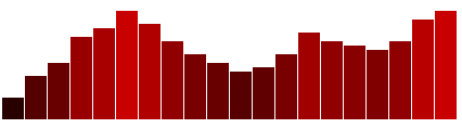
This is a great proof of concept, but it really isn’t a practical example. Although some applications of D3 are used to manipulate text directly, it’s typically used to create graphical representations of data. The next example will use very similar code to what was shown above in order to create a bar chart with SVG objects out of a static data set. Take a look at the code:
var dataset = [ 5, 10, 13, 19, 21, 25, 22, 18, 15, 13,
                11, 12, 15, 20, 18, 17, 16, 18, 23, 25 ];

var w = 500;
var h = 100;

//create the svg used for drawing
var svg = d3.select("body")
            .append("svg")
            .attr("width", w)
            .attr("height", h);

//create the rectangles used for the bar chart
svg.selectAll("rect")
   .data(dataset)
   .enter()
   .append("rect")
   .attr("x", function(d, i) {
     return i * 21;
   })
   //here we need to subtract from the height because SVG starts
   //in the top left corner
   .attr("y", function(d) {
     return h - (d * 4);
   })
   .attr("width", 20)
   .attr("height", function(d) {
     return d * 4;
   })
   .attr("fill", function(d) {
     return "rgb(" + (d * 8) + ", 0, 0)";
   });
We’re doing a lot of what we did before — initializing a data set and setting a few variables that will be used to define the width and height of the SVG area that will be used for drawing. From there, we can call select() on the SVG object itself to draw the rectangles within.
The same steps are being followed as before — selecting elements that don’t quite exist yet, passing those references to the data function to associate them with data, and then creating the markup and changing its attributes.
There are two attributes that change for each bar: fill and height. Width is based on a variable that’s set and doesn’t change. Because this is an SVG file, the function for height has to take steps to account for a starting point in the top left corner, which is why we see h - (d * 4) instead of d * 4 like you might expect.
What the function passed to the attr() function for fill is actually doing is setting an RGB value for each rect object. We’re taking the data value, multiplying it by eight and then concatenating that into a string that represents the RGB value of the bar. So, the higher the data value, the higher the red color in the RGB value. Here’s the final result:
Both of these examples have given an introductory look at how D3 can be used for powerful data visualizations. There’s much more you can do with the D3 tool, from adding axes or transitions to making your data interactive by responding to user input.
Advertisement