Tech tutorials Introduction to Styled Components
By Insight Editor / 16 Jan 2018 , Updated on 16 May 2019
By Insight Editor / 16 Jan 2018 , Updated on 16 May 2019
Cascading Style Sheets (CSS) has been the ugly step-sister of the development world. Many developers say, “I’m a developer. I don’t care how things look.” Bottom line: Since they don’t care about how things look, they don’t care to learn CSS. They should. Developers should learn CSS to know how an application should be styled and provide responsive and accessibility support. One caveat: CSS is hard. It can take years to become proficient.
There have been many attempts over the years to improve the quirks of CSS. Out of the box, CSS doesn’t support variables (custom properties have been introduced in newer browsers), loops or functions. Pre-processors such as Sass and Less add useful features. BEM, ITCSS and SMACSS also help. However, they’re optional and can’t be enforced at the language or tooling level.
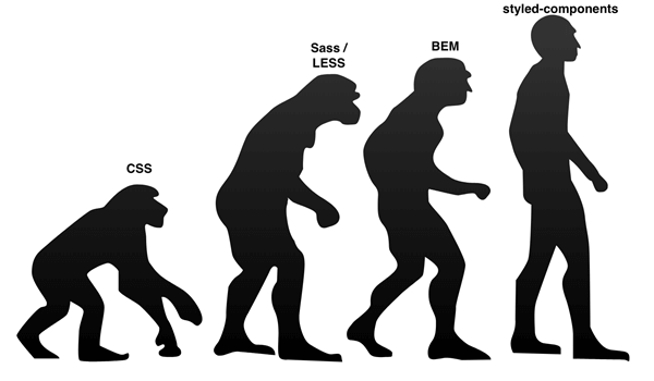
styled-components Evolution
Christopher Chedeau, aka vjeux, in his famous CSS in JS talk, lists some issues with CSS. A few issues include global namespacing, styling conflicts and dead code. During the past few years, developers have been looking for ways to improve CSS modularity. React, with a focus on building component-based user interfaces, started the wave of CSS-in-JS libraries.
So, what is CSS-in-JS? Rather than include CSS style sheets, all your CSS is written in JavaScript. According to Radium’s website (another library for inline component styling), the benefits of using inline component styling are:
There are dozens of CSS-in-JS libraries available, and more are released each week. Popular libraries include styled-components, glamorous, emotion, Radium and styled-jss. In this blog post, we’re going to review one of the more popular component-based CSS-in-JS libraries: styled-components.
Styled-components was created by Max Stoiber and Glen Maddern as a successor to CSS Modules and a new way of writing dynamic CSS for the “CSS folk.” Style-components currently has more than 150 contributors and 11,500 stars on Github. Styled-components makes components the fundamental way to build a styled user interface. It avoids potential collisions by scoping styles to the component.
Styled-components are created by defining components using the ES6 template literal notation. CSS properties can be added to the component as needed, just like you would do normally using CSS. Styled-components is just CSS, so it supports media queries, pseudo-selectors and nesting. These small components can be easily reused and tested. When the JavaScript code is parsed, styled-components will generate unique class names and inject the CSS into the DOM.
const Title = styled.h1`
  font-size: 1.5em;
  text-align: center;
  color: palevioletred;
`;
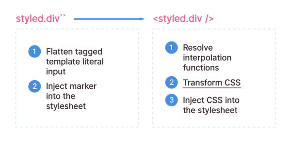
What actually happens when you create a styled component and render it?
Styled-components can be installed to a project using the following commands.
// if using npm
npm install --save styled-components
// if using yarn
yarn install styled-components
For the sake of simplicity, we’ll be using StackBlitz to walk through the examples. StackBlitz is an online Visual Studio Code integrated development environment for Angular and React. See examples.
Navigate to StackBlitz and start a new project using React ES6.
const Title = styled.h1`
  font-size: 1.5em;
  text-align: center;
  color: palevioletred;
`;

const Wrapper = styled.section`
  padding: 4em;
  background: papayawhip;
  font-family: Lato, sans-serif;
`;
render() {
    return (
      <Wrapper>
        <Title>
          Hello World, my name is Steve Pietrek!
        </Title>
      </Wrapper>
    );
  }
The code below lists all code changes for this example.
import React, { Component } from "react";
import { render } from "react-dom";
import Hello from "./Hello";
import "./style.css";
import styled from "styled-components";

const Title = styled.h1`
  font-size: 1.5em;
  text-align: center;
  color: palevioletred;
`;

const Wrapper = styled.section`
  padding: 4em;
  background: papayawhip;
  font-family: Lato, sans-serif;
`;

class App extends Component {
  constructor() {
    super();
    this.state = {
      name: "React"
    };
  }

  render() {
    return (
      <Wrapper>
        <Title>Hello World, my name is Steve Pietrek!</Title>
      </Wrapper>
    );
  }
}

render(<App />, document.getElementById("root"));
One of my favorite features using styled-components is the ability to compose new styles from existing components. Styled-components allows you to pass any component, not just DOM elements.
Let’s go back to StackBlitz and enhance the project.
const TitleBold = styled(Title)`
  font-size: 2.5em;
  font-weight: bold;
  color: red;
`;Since styled-components are components, it’s possible to pass props to the styled component. This allows flexibility in using our components.
Going back to our StackBlitz project, let’s update our TitleBold and Wrapper components to support changing the background and color CSS properties based on a prop passed.
const TitleBold = styled(Title)`
  font-size: 2.5em;
  font-weight: bold;
  color: ${props => (props.primary ? "black" : "red")};
`;

const Wrapper = styled.section`
  padding: 4em;
  background: ${props => (props.primary ? "white" : "papayawhip")};
  font-family: Lato, sans-serif;
  render() {
    return (
      <Wrapper primary>
        <TitleBold primary>
          Hello World, my name is Steve Pietrek!
        </TitleBold>
      </Wrapper>
    );
}Styled-components integrates many Sass features, such as nested rules and browser state styles (e.g., hover, active, focus). A common requirement is to change the state of a component when hovered.
const TitleBold = styled(Title)`
  font-size: 2.5em;
  font-weight: bold;
  color: ${props => (props.primary ? "black" : "red")};
  &:hover {
    text-shadow: 2px 2px black;
  }
`;
In the age of responsive design, it’s important for your components to be responsive. Styled-components allow you to define media templates.
const TitleBold = styled(Title)`
  font-size: 2.5em;
  font-weight: bold;
  color: ${props => (props.primary ? "black" : "red")};
  &:hover {
    text-shadow: 2px 2px black;
  }
  @media (max-width: 400px) {
    font-size: 1.5em;
    font-weight: normal;
  }
`;
Although you can use styled-components with no tooling, there are tools available to improve the developer experience.
Regardless of which CSS-in-JS library you choose, inline styling of components offers lots of great features and should be considered when building out React user interfaces. Using styled-components in your React applications will make your JSX easier to read, and your styling will become easier to manage.
You’ll also gain the power of being able to tie a component’s state directly to its styling, all from within the component itself. We covered some of the important features in this blog post. However, styled-components has much more to offer. Please review the documentation for additional information.
Advertisement